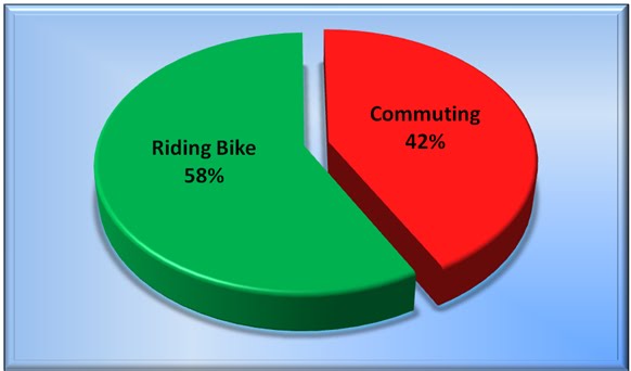
Right now it's just showing the relative proportions of time and nothing else.
But I have lots of data: times (of course) but also number of each ride, average time for each ride, and well I guess that's it for now.
Who thinks that's a good idea? I do.
Mostly today is a first try to get the pie chart into the blog post in an easy way for me.
As the year goes on, probably within the next week or so, I'll get the pie chart to look better with more information that will seem helpful
This was only a test. Except with actual data.

Cool verdant green for the cycling, and evil burning red for the auto commute!
ReplyDelete